Talk:The Phelips Museum: Difference between revisions
No edit summary |
No edit summary |
||
| Line 27: | Line 27: | ||
That´s the bar, the interior and one of the lusters. Maybe it´s not really necessary to put one of them additionally to the long shot(s) onto the page? | That´s the bar, the interior and one of the lusters. Maybe it´s not really necessary to put one of them additionally to the long shot(s) onto the page? | ||
What do you think? | What do you think? | ||
OK, I've put these up, so tell me what you think... And should we do a bit about the wine cellar? --[[User:Vulpes| <font face="Times New Roman" color="#9900CC">''Vulpes''</font>]] 04:23, 3 September 2008 (BST) | |||
Revision as of 03:23, 3 September 2008
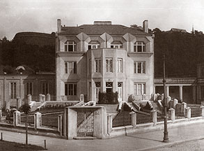
Which one of these fits the decor best? I really love the red one, and it's much more comfortable than the yellow one. It's a better example of cubism, too. What do you think?
 Do you think it´s OK for this place?
They're both great! The building pics for Malton tend to be dark, so I think the first one fits a bit better. I really like both of them, though.
O.K here are some pics of the café, hope you like it. As I said before I couldn´t decide which of them we should take, so I upped more than we`ll need. I dropped the b/w ones, think the colored ones look better...
That´s the bar, the interior and one of the lusters. Maybe it´s not really necessary to put one of them additionally to the long shot(s) onto the page? What do you think?
OK, I've put these up, so tell me what you think... And should we do a bit about the wine cellar? -- Vulpes 04:23, 3 September 2008 (BST)


