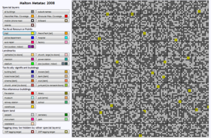
Malton Meta Tactical Map: Difference between revisions
From The Urban Dead Wiki
Jump to navigationJump to search
No edit summary |
(slight updates) |
||
| Line 5: | Line 5: | ||
*Author: --<span style="font-size:90%">[[User:Funt Solo|Funt Solo]]</span> <sup style="font-size:70%">[[Mod_Conspiracy|QT]]</sup> [[Image:Scotland flag.JPG|18px]] | *Author: --<span style="font-size:90%">[[User:Funt Solo|Funt Solo]]</span> <sup style="font-size:70%">[[Mod_Conspiracy|QT]]</sup> [[Image:Scotland flag.JPG|18px]] | ||
*Created: June 2006 | *Created: June 2006 | ||
*Last updated: | *Last updated: September 2008 | ||
*Current release: v1. | *Current release: v1.4 beta | ||
*Best viewed at minimum 1280*1024 resolution. (Oh noes!) | *Best viewed at minimum 1280*1024 resolution. (Oh noes!) | ||
*Tested in Firefox 2, Internet Explorer 7, Opera 9, Safari OSX. | *Tested in Firefox 2, Internet Explorer 7, Opera 9, Safari OSX. | ||
| Line 17: | Line 17: | ||
*Shows total potential [[Necronet_Access#List_of_Scientific_skills|Necronet]] coverage (and therefore permanent Necronet blind spots): | *Shows total potential [[Necronet_Access#List_of_Scientific_skills|Necronet]] coverage (and therefore permanent Necronet blind spots): | ||
[[Image:NnCoverageS.jpg]] | [[Image:NnCoverageS.jpg]] | ||
*The new title text has ''easter egg'' functionality (advertised by the title text seen on mouse hover): pressing it loads up layers I find particularly useful and nearly always have on anyway. (This is saving me 13 clicks every time I use it.) | |||
== Known bugs/issues == | == Known bugs/issues == | ||
| Line 22: | Line 23: | ||
*Instruction by experimentation: all buttons are toggles. | *Instruction by experimentation: all buttons are toggles. | ||
*No "clear" button. Browser refresh does the same job. | *No "clear" button. Browser refresh does the same job. | ||
* | *Rare (seen once) Firefox rendering bug doesn't apply the CSS on the first load. Therefore, buttons all appear to the right of the map, and all other browser default styles are applied (i.e. the page looks a mess). Refresh immediately fixes the problem. <s>Assume this is now fixed using new renderFix() function.</s> (That function was messing with the maximise window setting in Vista, so I commented it out.) | ||
*Tikhon General Hospital in Dartside is mistakenly marked as a factory. | *Tikhon General Hospital in Dartside is mistakenly marked as a factory. | ||
Revision as of 02:41, 1 October 2008
http://gribligs.net/UDmetatac/
Info
- Author: --Funt Solo QT
- Created: June 2006
- Last updated: September 2008
- Current release: v1.4 beta
- Best viewed at minimum 1280*1024 resolution. (Oh noes!)
- Tested in Firefox 2, Internet Explorer 7, Opera 9, Safari OSX.
Features
- The ability to choose to display/not display different building and/or empty block types.
- Suburb name overlay.
- Mobile phone mast overlay.
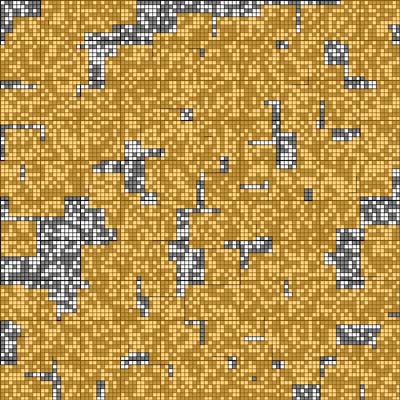
- Shows total potential Necronet coverage (and therefore permanent Necronet blind spots):
- The new title text has easter egg functionality (advertised by the title text seen on mouse hover): pressing it loads up layers I find particularly useful and nearly always have on anyway. (This is saving me 13 clicks every time I use it.)
Known bugs/issues
- Always starts out blank, so some users don't think it works. (Hint: click the buttons.)
- Instruction by experimentation: all buttons are toggles.
- No "clear" button. Browser refresh does the same job.
- Rare (seen once) Firefox rendering bug doesn't apply the CSS on the first load. Therefore, buttons all appear to the right of the map, and all other browser default styles are applied (i.e. the page looks a mess). Refresh immediately fixes the problem.
Assume this is now fixed using new renderFix() function.(That function was messing with the maximise window setting in Vista, so I commented it out.) - Tikhon General Hospital in Dartside is mistakenly marked as a factory.
Planned updates
- Add island overlay to show buildings not on the main Free Running network, and also to highlight that forts are a special case island type.
Suggestions
Please place any suggestions for improvements here

