User:DanceDanceRevolution/PMP
Project Main Page
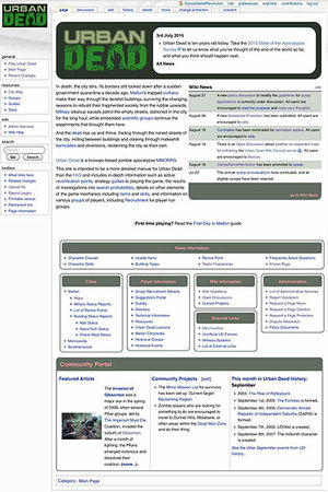
Just some notes and possible experimentation on ways the Main Page could be updated to be more community-oriented, and to more effectively utilise the screen real-estate for current information.
the reason it should be changed is because the most important part of the page, that is, the part of the page that you see without having to scroll or click anything, is completely wasted on a wordy blurb, a huge section for updates (that dont happen), and wiki news that kinda rarely gets used. the wiki is a resource for the community and that should be taking a more front-and-centre spot.
what to change
- Current News section- replace with something, possibly community projects and/or current events, followed by an abridged wiki news. note: code in the option to re-add Current News into the section if the game actually gets updated.
- featured article higher on the page.
- move the large lists of resources further down the page.
what to add
- an extremely compact version of the suburb map somewhere? consider: server load?
what to remove
- in its current state, remove Game News. wasted real estate.
- "in death, the city stirs" - remove and place in the Urban Dead page, and flesh that out as the go-to for explaining Urban Dead and all its mechanics. stop wasting fantastic real estate- but keeps it one click away.
what to consider
'group' showcase? cycle recruitment ads (small versions), daily? probably bad idea. THE CENTRAL SCRUTINIZER 11:34, 3 September 2018 (UTC)
notes on past designs
"if you want to look 5 years forward, you have to look 10 years back"- some 'futurist' at a greentech convention I went to in 2013.
How MP looked in:
notes
- Started simple, but more info got added on over time and less got removed as it became redundant.
- modules got added on without thought as to steamlining the design, until the AHLG-led effort between 2009-2011
- no changes seemed to reflect standards of other wikis at the time (eg Wikia game wikis or Wikipedia) and redundant information still appears
- Between 2010-2012, the Community Portal gets shunted from it's best historical position on the main page to the bottom, under a pile of resource links. still, IMO, not enough focus on community. I remember arguing against this change at the time.
- The Main Page should feel alive with community happenings, not bogged down with stale text...?
change sandboxes below
Changelog:
- Ensure that all removed links from the Navigation are supplemented through portal pages linked from the Main Page.
- Ensure that the removed Blurb's links (survivor, zombie, PKer, Malton, etc) are replicated as priority links at the top of new Navigation Panel.
Game Information
- Character Classes
- Character Skills
- Usable Items
- Revive Point
- Building Types
- Frequently Asked Questions
Cities
Player Information
Wiki Information
External Links
