
|
Use the '+' tab at the top in order to create a new talk section at the bottom. If I've come to you, let's keep the conversation there, if you're coming to me, I'll be replying here.
|
| The archive can be found here.
|
|
Thanks

|
A FREE COOKIE
|
| Linkthewindow has given The Rooster a cookie for for helping with the great suburb group massacre
| .
Thanks for your help (and also for lurking on my talk page so often.) Linkthewindow Talk 05:32, 4 March 2009 (UTC)
U doan liek..
..my congratulations for Link? :'( --Janus talk 13:28, 4 March 2009 (UTC)
- Of course not, he's awesome. Just trying to keep the news matter-of-fact tis all. Otherwise all the other recent successful promotees look unloved. Can't have people thinking they're not loved, or they might attempt a wiki-coup. --
 RoosterDragon RoosterDragon  18:51, 4 March 2009 (UTC) 18:51, 4 March 2009 (UTC)
- Well, they could also hide. --Janus talk 21:57, 4 March 2009 (UTC)
Sig
I've had it for 6 months and used it on both Chrome and Firefox and I never saw anything wrong with it. DANCEDANCEREVOLUTION (TALK | CONTRIBS) 23:01, 5 March 2009 (UTC)
Yet this sentence which I'm typing now will get overlapped horribly. Watch as this typical superscript with no size changes overlaps with the subscript quiet easily indeed. (I think I've got enough text there so that it will occur at most res's) The change you made to make the letters smaller fixes the problem when people use newlines to break text which is what happens most of the time. If text is broken with a br-tag (like this message) or used by a template in a similar fashion it might still cause problems with superscript. It is a rare occurrence though. -- RoosterDragon 16:36, 6 March 2009 (UTC)
Preliminary Discussion
The design for the new main page seems good to go, however I'm discussing some supposed colour problems with Honest. Before I forget, I have a few good ideas for the Community Portal:
- Articles needing work - Meaning an entire list of articles, or ones of top priority
- Ongoing discussion - Things that wouldn't be on Wiki News but that require attention
- Community Projects - A full list of the active/ongoing ones, the rest archived
- Technical help - Technical wiki questions (not like "how do I sign?")
- General notices - Again, something that isn't announced on the main page but needs attention
- Other things the community would be interested in
Probably couldn't be all on the same page, so there'd be links to some of these (such as technical help). -- AHLGTG THE END IS NIGH! 19:59, 6 March 2009 (UTC)
- Good thoughts and some similar to some of what I had in mind too. I must pick your mind over whether the page is 'good to go' though. I did a count of the yays v nays and got 16v16. That's not a majority opinion by any means. We can't go acting on such numbers, surely? -- RoosterDragon 13:46, 7 March 2009 (UTC)
- You have to read the comments they put. I've managed to shave down all the nays to basically "the colour". -- AHLGTG THE END IS NIGH! 16:46, 7 March 2009 (UTC)
- Unless you can properly address it, and even if you do, you'll still be looking at an unpromising ratio of votes to try and convince whomever happens by A/PT when you request it. -- RoosterDragon 17:50, 7 March 2009 (UTC)
- There aren't any guidelines to implementing such a large change, really it just boils down to getting as much support through compromises and changes. I'm sure whatever sysop looks at the request will see what it's gone through to get it liked by everyone as much as possible and the fact that's impossible to get it yay'd by everyone, unfortunately. You'll probably find that there's a significant lack of complaining on the talk page if/when it gets implemented.-- AHLGTG THE END IS NIGH! 18:47, 7 March 2009 (UTC)
- Yeah, one would hope so. I'll defer to you on that. Moving on, the CP does indeed need some major re-organization, and adding some of the above pages as sub-pages as needed will be a start. The actual CP page itself will need re-doing since it's going about everything all wrong. -- RoosterDragon 19:50, 7 March 2009 (UTC)
Slightly off-topic, but do you see rounded borders here? -- AHLGTG THE END IS NIGH! 00:11, 9 March 2009 (UTC)
- Nope :) I viewed one of the images somebody had posted in the main page discussion, showing the borders on the design. The aliased edges are pretty disturbing, so I get to win on that count regardless. -- RoosterDragon 17:06, 9 March 2009 (UTC)
- Ah, well. The corners look much better on a Mac, much smoother. Lots of things look better on a Mac. Yep. Mac. Buy a Mac. Now. -- AHLGTG THE END IS NIGH! 20:36, 9 March 2009 (UTC)
*Ehem* last thing. It seems smart to mention the Community Portal reboot in the CP section on the main page. Do you have anything in mind? Are we calling this project anything? -- AHLGTG THE END IS NIGH! 22:29, 9 March 2009 (UTC)
- Yeah, make it the top message in the CP section, that's a good thought. Doesn't need a project though. -- RoosterDragon 22:40, 9 March 2009 (UTC)
- Everything is up to date and ready, unless you spot something wrong. I noticed that the CP section stretches the full width when the Wiki News section is small. A good thing, it cuts down on the white "emptyness." The CP section is of course still lacking, but we'll worry about that later. Yarp?-- AHLGTG THE END IS NIGH! 02:45, 10 March 2009 (UTC)
- Your magical code means that it auto-adjusts perfectly. I saw a full width CP even when the news was medium length, and it cleverly stole the CP's room when I windowed it to test 800*600. It's brilliant. Anyway, I just whipped through and made the most pedantic edits I think I'll ever make. For the most part it was just capitalizing the letters in the hex code. In the nav links though (box8 I think), the pink header text has a font size of 102%. That seems a bit pathetic, is it important in some way, or can it be dropped? Finally, and I'm probably insulting you merely by suggesting that you overlooked it, you do plan on templating the "Last Game Update" table at the top of the page, right? Otherwise, no more narks I can see. -- RoosterDragon 20:39, 10 March 2009 (UTC)
- Bah, yeah I've forgotten the {{Lastupdate}} template. The teeny 102% increase in font size was requested, it does make a difference, albeit a small one. I'll make the request later, couple of hours I suppose, when I have the time. Since I need to explain what goes where.-- AHLGTG THE END IS NIGH! 20:50, 10 March 2009 (UTC)
Um, hehehe. Anyways, we're going for a complete redesign for the CP, right? I'll cook something up. -- AHLGTG THE END IS NIGH! 16:26, 12 March 2009 (UTC)
- Yay for collateral damage, I've replaced it with a lolcat for now, so knock up something soon if you can. -- RoosterDragon 17:41, 12 March 2009 (UTC)
STARS is still active.
http://wiki.urbandead.com/index.php/STARS -- President Jackson 16:44, 7 March 2009 (UTC) President Jackson 16:44, 7 March 2009 (UTC)
- And this concerns me how? -- RoosterDragon 17:33, 7 March 2009 (UTC)
EMRPs
Replied here.
Also, a bot to maintain the User Hub? ■■ 19:08, 9 March 2009 (UTC)
- Maintain in what fashion? And does anybody even use the thing? -- RoosterDragon 20:06, 9 March 2009 (UTC)
- See it's talk page, most recent edits. See what its creator thinks? ■■ 22:28, 9 March 2009 (UTC)
- I officially define that page as "I can see the advantage" on the scale of pages that can benefit from scripted maintenance and "Meh" on the scale of pages for which it would be worth the effort. I'll get Link's opinion though. No doubt his talk page will interest a few other users since it gets stalked so much, mine is backwater by comparison. -- RoosterDragon 22:40, 9 March 2009 (UTC)
- Stole mah idea for the mall logos >.> ■■ 00:37, 10 March 2009 (UTC)
Danger Reports
Mmh.. I don't know if it's changed now because of the bots, but just wanted to say that Lazarus General Hospital doesn't have the template. :) --Janus talk 00:32, 10 March 2009 (UTC)
- Most things don't have templates. The Timekeeping Bot just marks report unknown, it doesn't create missing reports. Forts, Malls, NTs, Large Buildings, MPMs and the Zoo have templates. TRPs have a decent coverage of templates, but not all. The generic stuff might have a template if you're lucky. -- RoosterDragon 20:11, 10 March 2009 (UTC)
Thanks for the sig help!
Cock a doodle doooooooooo! --Paddy DignamIS DEAD 22:49, 12 March 2009 (UTC)
Question
Would it be possible to write a bot to change pages with Category:Human Groups to Category:Survivor Groups? -- Cheese 23:41, 12 March 2009 (UTC)
- Easily, yes. I could manually nab a copy of the pages listed in said category, have them loaded individually and then just find/replace [[Category:Human Groups]] to [[Category:Survivor Groups]]. Job done. -- RoosterDragon 23:45, 12 March 2009 (UTC)
The NT/Fort/Mall Status Map
...is lovely. Great work! ~ extropymine Talk | NW | 4Corners 22:33, 13 March 2009 (UTC)
- You think so? I can get a decent overview from the NT Status Map myself, but there's too many colours here and I find I have to concentrate on portions of the map to make heads or tails of it. How well are you able to cope? -- RoosterDragon 22:37, 13 March 2009 (UTC)
- Well, I stare at the NT Map a lot, so honestly it doesn't bug me anymore. However, I can see from a newbie POV that it might seem crowded or confusing. So... hmm. Personally, I never found the "flow" of colors in the dangermap to be particularly good. I like green (safe) to yellow (attack) to orange (siege) to red (ruined) as a degree of danger, but purple isn't an intuitive "hostile" color, and it's supposed to be "in zombie hands," which is pretty damned hostile.
- In all honesty, having been making rounds with NecroWatch the last month, from my POV "under siege" is a useless status, since it implies a sense of immediacy that the Wiki doesn't do a good job with. Either something is under attack or its not; am I going to go there faster because someone rated it as "under siege"? I feel the same way about blue for "rebuilding"; I don't know what it's supposed to mean. People (including myself) just seem to use it to say "no zombies, but not powered and EHB either," and so it's a pretty vague status.
- I guess what I'm saying is that I would support changes to simplify the status color scheme, if someone suggested it. I'd get rid of "under siege" entirely, and I would probably combine "ruined" and "in zombie hands" into one status (since really, what's the functional difference to someone using this map?).
- Sorry, I'm rambling a little. Other things that might help "break up" the combined status map might be thin borders around the forts and malls, to help subtly distinguish them and make the map a little easier on the eye. ~ extropymine Talk | NW | 4Corners 22:59, 13 March 2009 (UTC)
- Rambling is awesome, people actually say enough that you can guage their opinion properly, and it makes for interesting discourse!
- The system has been around longer than me, and I've had to work around it. The MPM page has this sort of sliding colour scheme (with purple = in zombie hands) and so I adopted that. It's less intuitive as hostile, maybe, but flows on from red in the colour spectrum so it could be worse than say a random beige colour or something. I had no idea what to do with rebuilding TBH, it's a weird fucking status and so I just borrowed the blue colour from the fact it's little image has a blue background. As an aside, rot revive is brown since these NTs are usually ruined, so brown is similar to the ruined red colour, since the building can be sucky as a safehouse but isn't unsafe persay.
- As far as under siege goes, I'm not entirely against it, it's so rare that any building actually holds out long enough to attract a zombie horde big enough that I find it interesting to see orange pop up occasionally. As an indicator of status, well yeah, it's not that useful I guess. I do support the distinction of ruined/in zombie hands though. Ruined means you can walk in and fix the thing up right off, in zombie hands means you're gonna need some guns and patience first. Mapwise, you could combine them I guess, though I'd feel like I wasn't making the most of all the possible statuses. Ransacked/ruined is combined, though (It's a pointless difference anyway, no buildings stay ransacked for longer than the ten seconds it takes just to go for the ruin)
- I was considering putting a 1px black border round the forts, with a gap on the gatehouse square, just for the heck of it (and maybe back it up with some waffle about not being able to enter through those sides). I don't think much more is needed to differentiate the three buildings though, NTs all being 1x1, malls 2x2 and forts 3x3, that's a great differentiator-in-a-can right there.
- If you ever do suggest redefining some of the statuses, give me a shout, I have some rambling about changing the little images so the background colours make more sense on a sliding scale of danger. Maybe a good idea to bring to the CP once that's been revamped. -- RoosterDragon 23:54, 13 March 2009 (UTC)
- I'll let it squoosh around in my brainpan a bit more. I like the idea of indicating the gatehouses on forts quite a bit.
- As long as something goes up to replace the horrible (and I mean horrible) Mall map page, I will be happy in the short-term ;) ~ extropymine Talk | NW | 4Corners 02:24, 14 March 2009 (UTC)
Why do Williamsville and Miltown lack a border as part of their danger color scheme? ~ extropymine Talk | NW | 4Corners 08:59, 15 March 2009 (UTC)
- Looks fine to me, maybe somebody was messing the reports around earlier? -- RoosterDragon 11:50, 15 March 2009 (UTC)
- Still looks funny to me... here's a screen grab. Look at Lockettside, Williamsville and Miltown:
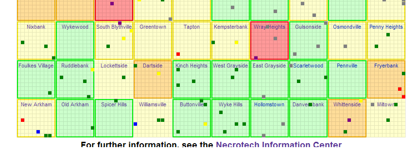
- See how Lockettside, Williamsville and Miltown don't have colored borders? ~ extropymine Talk | NW | 4Corners 08:29, 18 March 2009 (UTC)
StatusMap Colour Tweaks
Anyway, as I have been thinking about it, it seems to me like the danger level should progress like this...
| Safe
|
Under Attack
|
Under Siege
|
In Zombie Hands
|
Since "In Zombie Hands" is more dangerous than "Ruined" in actual play. For the other statuses (stati?), I'd mostly keep them as they are, with one minor change...
| Ruined
|
Unknown
|
Rebuilding
|
Rot Revive
|
I made "Ruined" a very dark grey (I'd also thought about white with a thin black border), to evoke more of a ruined feel to it. Anyway, what do you think? I worry any change might be a struggle to get any of this past the community, but maybe I'm wrong. ~ extropymine Talk | NW | 4Corners 08:29, 18 March 2009 (UTC)
- I think I traced the problem with the borders, those reports had a space between the template and the noinclude, which doesn't seem to be a problem for IE but seemingly FF doesn't like it. I fixed two of them, see if you're still getting the error with that one, if so, just edit the report and remove the space. I noticed from your pic that the gridlines are actually 1px too high. I set them to be -1px so they worked for me, I might have to try setting them to 0px like they should be and seeing if I can find a way to get both browsers to align it the same.
- The colours used on the StatusMap are not a worry community wise, I seriously just made them up on the spot when I created the whole system, and I'm more or less still the only editor of the system. If you change the key, you'd probably get no complaints, if anybody even noticed. Anyway, I can see sense in the top four for a sliding scale. Unknown should certainly be the gray it is now. The other three are a toss up. Ruined is a sort of 'kinda' dangerous and rebuilding is a 'kinda' safe. Maybe that should be reflected somehow? And rot revive is still weird. Usually they are ruined, but usually not that unsafe, sometimes they are even caded and decaded as needed, therefore being safe 99% of the time.
- Maybe a pink colour for ruined (not the eye-burning kind, more of a pale red) and a pale green for rebuilding? The pink/pale red would complement the red or gray of VD and GT burbs, respectively, that those buildings tend to be in, while pale green goes with green and yellow of safe and moderate. Guess rot revive could stay brown. Brown is an odd colour, so it suits the odd rot revives. Something about having ruined as dark gray just doesn't cut it for me. Do keep pinging the ideas back and forth, and hopefully we'll up with something sensible by the end. -- RoosterDragon 16:47, 18 March 2009 (UTC)
- That space between the template and the noinclude was spot-on. I changed that last one and it looks fine in FireFox now. ~ extropymine Talk | NW | 4Corners 16:59, 18 March 2009 (UTC)
Colour Tweaks Continued
Okay, so you're thinking something like this?
"Danger" Statuses
| Safe
|
Under Attack
|
Under Siege
|
In Zombie Hands
|
"Transitional" Statuses
| Ruined
|
Unknown
|
Rebuilding
|
Rot Revive
|
~ extropymine Talk | NW | 4Corners 05:39, 19 March 2009 (UTC)
- More or less yeah. You think it's reasonable? -- RoosterDragon 18:03, 19 March 2009 (UTC)
- Seems good to me, but maybe a test run to see if the pastel colors of the "transition" statuses fade too much into the suburb danger colors. ~ extropymine Talk | NW | 4Corners 05:20, 20 March 2009 (UTC)
- Yeah I won't use those exact colours. Whatever I can get to show up and maintain the same brightness/saturation for consistancy within the danger and transitionals. -- RoosterDragon 20:31, 20 March 2009 (UTC)
- The other thing worth doing (probably) is looking at the danger status images. I don't know whose "property" they are (if anyone's), but for example...
 - It'd be neat to change the background color from yellow/orange to green, to match. Is that worth pursuing? ~ extropymine Talk | NW | 4Corners 21:25, 20 March 2009 (UTC)
- Yeah, I had a similar thought in my little rambling section of my sandpit. That would probably need community support since they're so umbiquitious. Hagnat made them originally, but they aren't 'owned' persay. I was figuring raising the issue at the CP once that revamp is done. -- RoosterDragon 21:31, 20 March 2009 (UTC)
- Well, I've got your back, if and when you do. ~ extropymine Talk | NW | 4Corners 21:42, 20 March 2009 (UTC)
Hey, I have another little pipe-dream about the Status Map. When you mouseover a building, you get "The BLAH Building is safe". Is there any way at all to make that fuctionality draw off the timestamp of the danger report that gives it that color? For instance, I just updated the Hippesley Building as rebuilding and signed my update with a timestamp. Is there any way to make stat status map show
The Hippesley Building is rebuilding ( ~ extropymine Talk | NW | 4Corners 22:15, 20 March 2009 (UTC))
when you mouseover, or something similar? Or is that not possible? ~ extropymine Talk | NW | 4Corners 22:22, 20 March 2009 (UTC)
- Probably not within the constraints of wiki-markup. I originally wanted to show the timestamps, but you need to include the whole userline in the tooltip, which means you see all the markup and it didn't work that well. If there is a way, it's well beyond my skills. -- RoosterDragon 22:25, 20 March 2009 (UTC)
- Your skillz pay the billz, so don't sweat it. Unless there was a way to draw the code in a form like the recent updates page, where it filters out signatures and such, I can see it breaking the tooltip. ~ extropymine Talk | NW | 4Corners 22:32, 20 March 2009 (UTC)
I changed the colours on the maps (yay for my supurb planning ahead, only 1 edit per status!) Unfortunately the background to the safe and V.D 'burb statuses are pretty much the same pastel we were aiming at, so I've darkened them to be somewhere inbetween the usual safe/in zombie hands colour and the background burb colour. It doesn't seem too bad, but I dunno, could go either way on it. -- RoosterDragon 23:22, 20 March 2009 (UTC)
- My initial reaction: it looks great, and flows much better. I only have a couple things with it. Under Siege needs to maybe "pop" more as a color (one shade more red?), and I think Under Attack could go one shade more orange. Both blend in a little too much. I think Rebuilding looks great, but somehow the color for Ruined doesn't say "ruined" to me. But by golly, this is progress! ~ extropymine Talk | NW | 4Corners 23:51, 20 March 2009 (UTC)
- Yeah the ruined doesn't come across great, but I rather like rebuilding. I redid under siege and it stand out much better, but the yellow of under attack refuses to come out nicely, it didn't before and it doesn't want to now. I tried a few and it just sucks on orange backgrounds if you notch it too far towards orange or darker, and sucks on yellow like now. -- RoosterDragon 00:12, 21 March 2009 (UTC)
- Siege looks great now, and yeah... I'm not sure what you can do with Under Attack. It's either blending in to Moderate or Dangerous. So, hmmph. ~ extropymine Talk | NW | 4Corners 00:26, 21 March 2009 (UTC)
Recruitment and ad size
Hi. :)
You've just got me slightly confused over two of the points of your proposed plan (currently up for voting):
- If you are using a fixed table width, your advert is limited to 600*800px.
--For example, using style="width:600px" in your table gives a fixed 600px wide advert on all screens. If in doubt, use this code.
Why 600*800px? That is more height than the lowest resolution, 800*600px, can display. That would result in ads being 200px out of screen. 600*600px limit would result in it still being in screen as that accounts for the sidebar and gives the correct height.
- If you are using a variable or scaling table width, your advert may be no longer than 800px when viewed on a 800*600 resolution.
--For example, using style="width:100%" in your table gives an advert that uses 100% of the available space, which varies depending on the person viewing the advert.
Not sure of the use of the term 'longer'. Do you mean width or height? In either case it cannot be 800px while on a 800*600px resolution as (as mentioned above) it would result in the ads being outside of the screen. It might not be necessary to state a max value for px, easier to just state; 'you may not use a variable higher than 100% for both height and width'.
If you could make clear if I am misunderstanding that would be helpful, I'm pretty much for the changes, I just want to be sure what exactly is being said. - User:Whitehouse 22:56, 13 March 2009 (UTC)
- The 800px height limit is designed not to ensure that ads are viewable to the 800*600 folks without needing to scroll. That would be horribly restrictive as we'd need something along the lines of a 600*400 max which is restrictive. The 800px height limit is just to prevent people having stupidly long ads, and on proper resolutions scrolling will be minimal, a group should take into consideration the scrolling issues and the formatting etc anyway, it's their ad so they are responsible for its appearance. The overall limits are to prevent ads interfering with the page as a whole.
- The ambiguous 'longer' means height. Can easily replace it with 'higher' to be totally obvious. Again, this is needed to ensure non-mad advert length. A person can skirt the measures by setting width 100%, the browser will happily scale to full width and be left to its own devices in deciding the height needed so an advert that is overly long would still go over a screen, or 800px, or anything you might set as a limit. Forcing them to set both means the advert A) Has to fill the screen, even it this leaves space everywhere. B) Defeats the object of setting the absolute limits in the first place. Variable settings are used but sometimes people don't consider squashing the ad to a small res to test it at which point it starts breaking stuff because there's not enough room. Absolute settings means that WYSIWYG for any res, so it's harder to go wrong and also easier to enforce.
- I'll correct the 'longer' thing. Otherwise if you feel it's still a bad proposal then by all means shoot it down, hopefully more people would get involved in refining it properly next go, damned discussion barely went anywhere on the size limits... -- RoosterDragon 23:34, 13 March 2009 (UTC)
Legends of Darkness
My Dark Mistress, Psychotic Pantomime, has informed me you have been most helpful in your suggestions (catergorize LoD, bots). However, I am more wiki savvy then here (I steal code and learn how to use if for my purposes). I am most interested in your suggestions, but not solid enough on my own coding to implement them myself. Hit up my talk page or LoD talk page where you have been posting if you are interested in helping us.
Peace,
Donald Crane, Panty's right hand man.
- If you're referring about the category, all you have to do is go to that page and edit it so it has some content, job done. Since it's your category I was going to let your group do it. As to the suggestions, I'm not sure what suggestions you're on about, all I wanted to do was let you know your category was a redlink... -- RoosterDragon 19:48, 17 March 2009 (UTC)
Rooster, Alka Selzer has taken the time and trouble to turn the Recon Map into an actual template! I'm not sure whether it should remain in his user space or if it should be moved into the general template category, though. Can you chime in on the discussion on the NW talk page and let us know what the best course is? Thanks! ~ extropymine Talk | NW | 4Corners 15:51, 19 March 2009 (UTC)
- If it's done, it should probably be moved to the template namespace since it can be used by everybody. -- RoosterDragon 18:05, 19 March 2009 (UTC)
Have you...
upgraded to IE8 yet, its out of Beta now? --D.E.ATalk 14:15, 20 March 2009 (UTC)
- Thanks for the message, I have upgraded now. -- RoosterDragon 19:37, 20 March 2009 (UTC)
- No problem. :) It was only after I tried that nifty little 'Compatability View' feature that I noticed the difference in the main page setup. Just glad that it was an IE7 error and not an overall IE error, otherwise we'd still be staring at the main page attached to the top of the screen. --D.E.ATalk 19:57, 20 March 2009 (UTC)
- Yeah, the IE team seems to be finally getting their act together after the horror that was IE6. I must retest acid 3 sometime and see how it's doing on that front. -- RoosterDragon 20:01, 20 March 2009 (UTC)
|


